A2 Music Blog: lNKK
Friday, 28 March 2014
Thursday, 27 March 2014
Audience Feedback

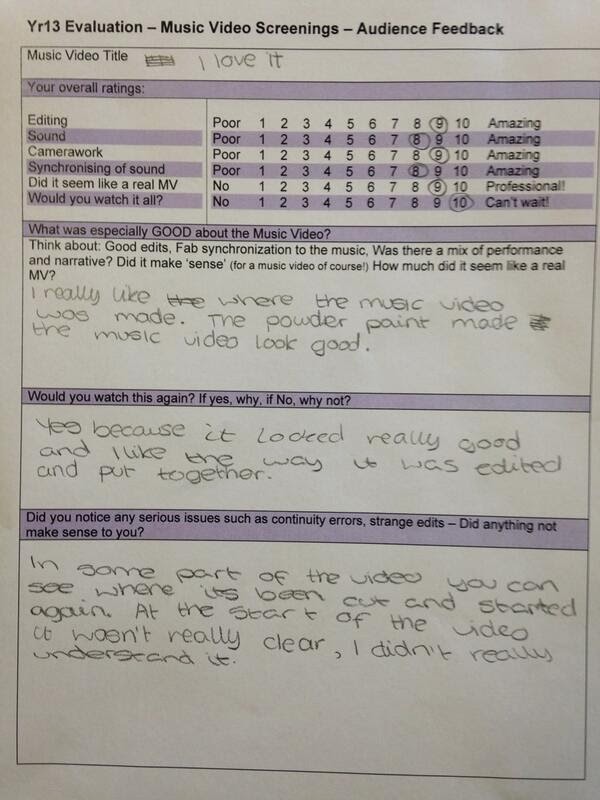
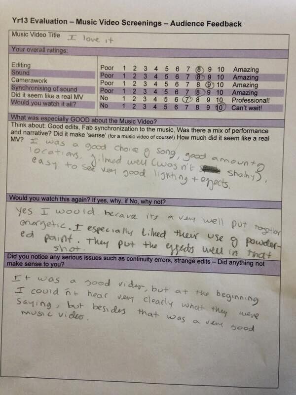
In Today's lesson we reflected on our music video and asked the teachers and a group of year 10 students to watch the music video and give us some feedback before we would hand it in. The response was very positive according to the feedback sheets. The common consensus was that they believed the camera work and editing technique was great and they loved the Powder Paint scene in particular, however in the critique they said that the beginning was quite confusing and they didn't understand what was going on, this could be down to the lack of concentration or distraction, or the fact that they are on the younger scale of are target audience so they might not get it's correlation to the song. Overall the feedback was great, one teacher stated that "one clip is too long", however after analysing it as a group and with other teachers we agreed that it benefited the feel of the video rather then hindered it.

Tuesday, 11 March 2014
Name of Artist
Today we decided on the name of our artist, at first we where thinking of keeping the name as Katy Williamson but decided to branch out and research some names that we liked. The theme for the chosen name would be powerful, mystical and unusual. At the beginning we where going to make it an extended name like the artist 'Florence and the Machine' as it makes it seem fuller however, once we chose the name we felt it was strong enough by itself.
List of names we liked:
Flora
Esme
Freya
Saffron
Amber
KT
Katee
Pandora
Xena
Delilah
Isla
Ariel
Dixie
Luna
CHOSEN NAME:
Tuesday, 4 March 2014
Meeting 4/3/14
Today we could not add any more film as we are waiting till Friday to film out final scene of the video. So today we decided it was important to do the colourisation of our opening scene, we where unsure on how we will create the transition between the sepia tone in the housewife shoot and the brightness of the London shoot. We decided to experiment with the colourisation by reducing the saturation on the beat of the music and the pace of body movements, however when watching it back we realised that the transition was clumsy and simply looked like the lighting had changed. We have to review this again when we next edit.
Friday, 28 February 2014
openings
After refilming and editing the opening we feel it looks much better and that the reshoot was a success. The opening is longer and so more meaningful and it flows better due to better match on action shots. Also the choice to use bigger cream cakes places more emphasis on the action and therefore helps to make it look more significant and effective than the previous shots.
Tuesday, 25 February 2014
Editing - 25/02/14
Today we uploaded the footage we reshot of the 1950s housewife opening. We are a lot happier with this footage that we were with the original, it looks more professional as well as the fact that it allowed up to develop the opening a bit more than we had. We made several improvements to the shoot and made sure that we wouldn't have to reshot it again. We now have a great amount of shots to work with.
Improvements
The only issue is it may make the opening longer than we had anticipate and this could potentially be an issue.
Improvements
- Change to Katy's outfit - No cardigan
- Bigger cake to have more of an impact when it hits
- Change to the Radio - More old fashion looking to suit the time period
- Added dialogue to make the opening easier to understand
- Change to Taran's outfit - More formal
The only issue is it may make the opening longer than we had anticipate and this could potentially be an issue.
Monday, 24 February 2014
Re-shooting
We decided to re-shoot the opening scene of our music video
as we had a few faults that could not be edited through available software, for
example we were unsure of what to do with the dialogue, it was not clear or
adequate enough to be used, and if we decided to add dialogue in a voice-over,
it may have looked amateur. Also, another major problem was the cake throw; the
size of the cake was far too small and the aftermath of the throw wasn't shown. In the re-shoot we bought a bigger cake and three of the same so we could
re-shoot from different angles to create a dynamic shot. We
also wanted to build suspense and mystery of the characters at the beginning of
the sequence, so in the re-shoot we filmed below the face for a matter of seconds.
Furthermore, we also replaced the previous newspaper with a 'Business' paper as
it mimicked the male characters 'formal' and ‘important’ demographic. We
decided to incorporate a crossword as a basis for the characters to
communicate, however there was not a crossword within the newspaper so we had
to lightly cellotape one inn. A problem we faced was that the newspaper we got
it from was much smaller than the broadsheet we were now using so it looked
unrealistic. A resolution to this was placing it on the right side of the paper
so there would be no shadows when shooting and it made it possible for him to
fold the newspaper on the table. Another problem we faced was that when we
filmed all the cake throwing we assumed that we had done enough, so decided as
a treat to ourselves and our helper we would share half of the last cake,
however we had realised that we forgot a shot and hate to somehow fix a broken
cake; but with lots of icing mix left we managed to retrieve it.
Subscribe to:
Comments (Atom)


